Association of 40000 Painters
During early years of our careers we designed a few book series for different publishers. We usually designed layouts, covers, and two or three final books, before handling the project with precise instructions over to designers working full-time for the publishers. This was a challenging, but satisfying task, and we enjoyed working on this type of projects.
In 2009 Kuba Banasiak asked us to design a book series for him. Those books were supposed to be filled with texts, with an occasional reproduction here and there. Just an elegant, light and easy to carry pocket books.
Ow… and Kuba didn’t have any money for it. But we knew each other long enough to consider his proposition and without too much hustle we sad yes.
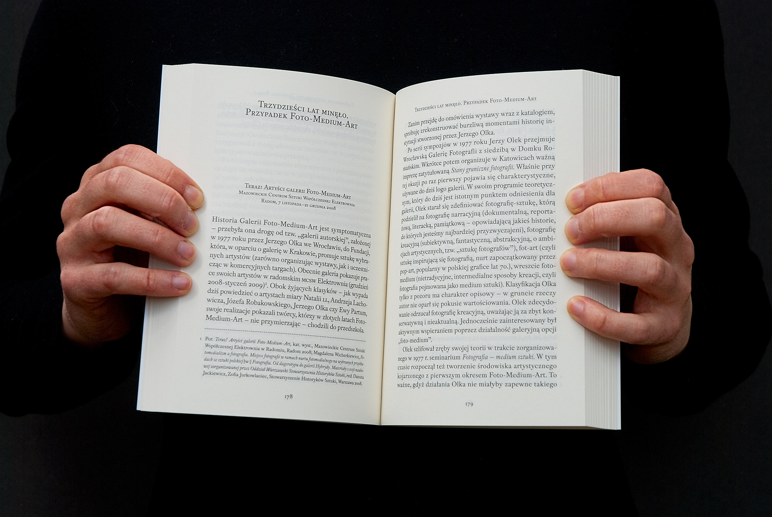
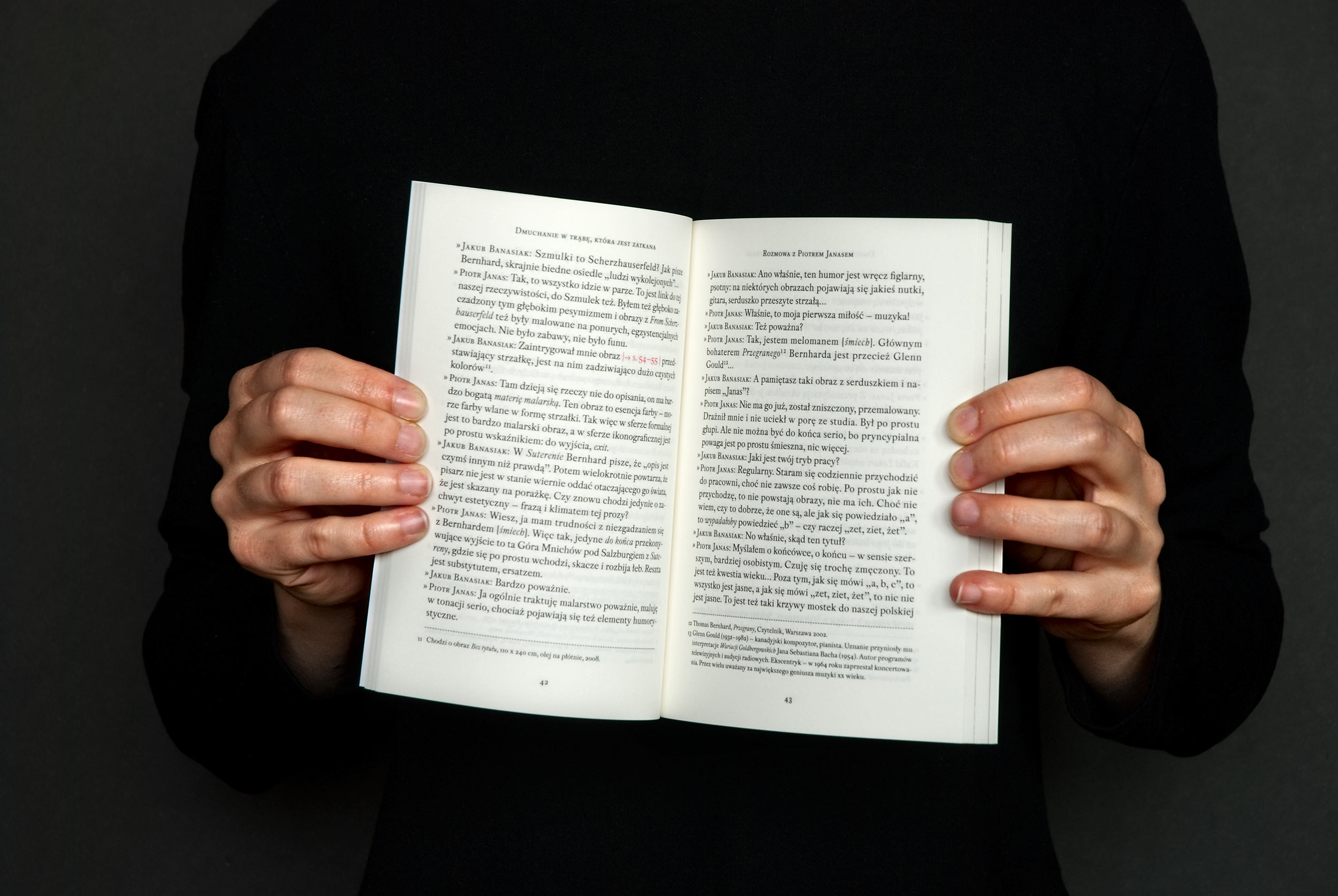
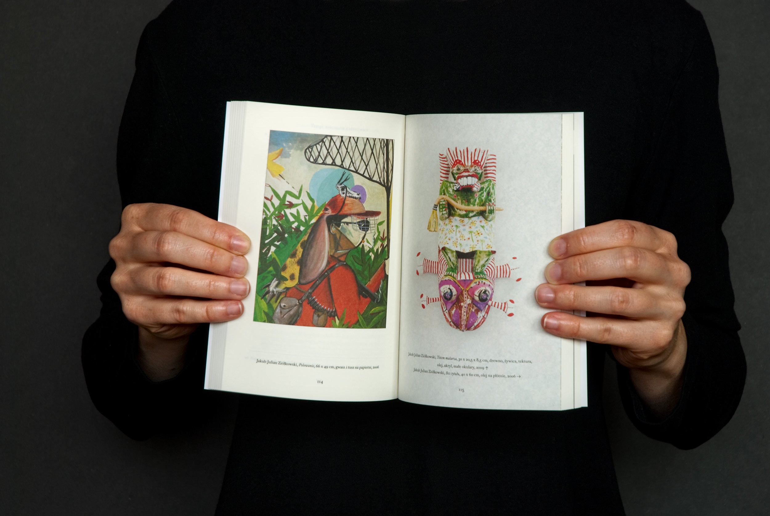
Our role was not only to design the series, but also to typeset and prepare every volume for printing. As stated above, Kuba really didn’t have any money, so hiring some DTP operator was out of the question. That wouldn’t be such a problem if most of the books would be mainly filled with text. A few smart InDesign scripts and a couple of hours of handcrafting would do the trick. Unfortunately, most books had image on every second page.
Correcting and separating colours for hundreds of different and often low quality images was boring as hell, but at least we’ve learned how to prepare images for offset printing on uncoated papers (we used Munken papers if Kuba had money, and Panta if he didn’t) and after a year or two we’ve become really good at it. That skill proved to be useful in most of our future books – for example in “Maps” we’re using Munken Polar Rough.
Another pain in the ass was excessive amounts on footnotes. In some books there were pages with footnotes covering 60% of the spread. It was hard to solve without missing a line or moving footnote to adjacent page.
From 2009 to 2014 we designed and typeset the first 22 volumes.
For the covers we needed and concept that would fulfill specific needs:
The design had to accommodate very different subjects and aesthetics.
The series as a whole had to be recognizable and coherent.
Individual covers had to be different from previous covers in an obvious way.
The concept should work with infinite number of covers.
Creating new covers in the series had to be fast and easy, because one day someone else would continue working on them.
Sometimes we would have to cooperate with cheap offset print houses, so the design had to be quite easy to print.
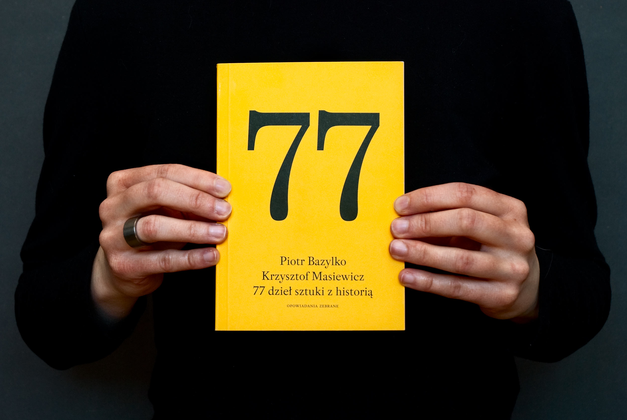
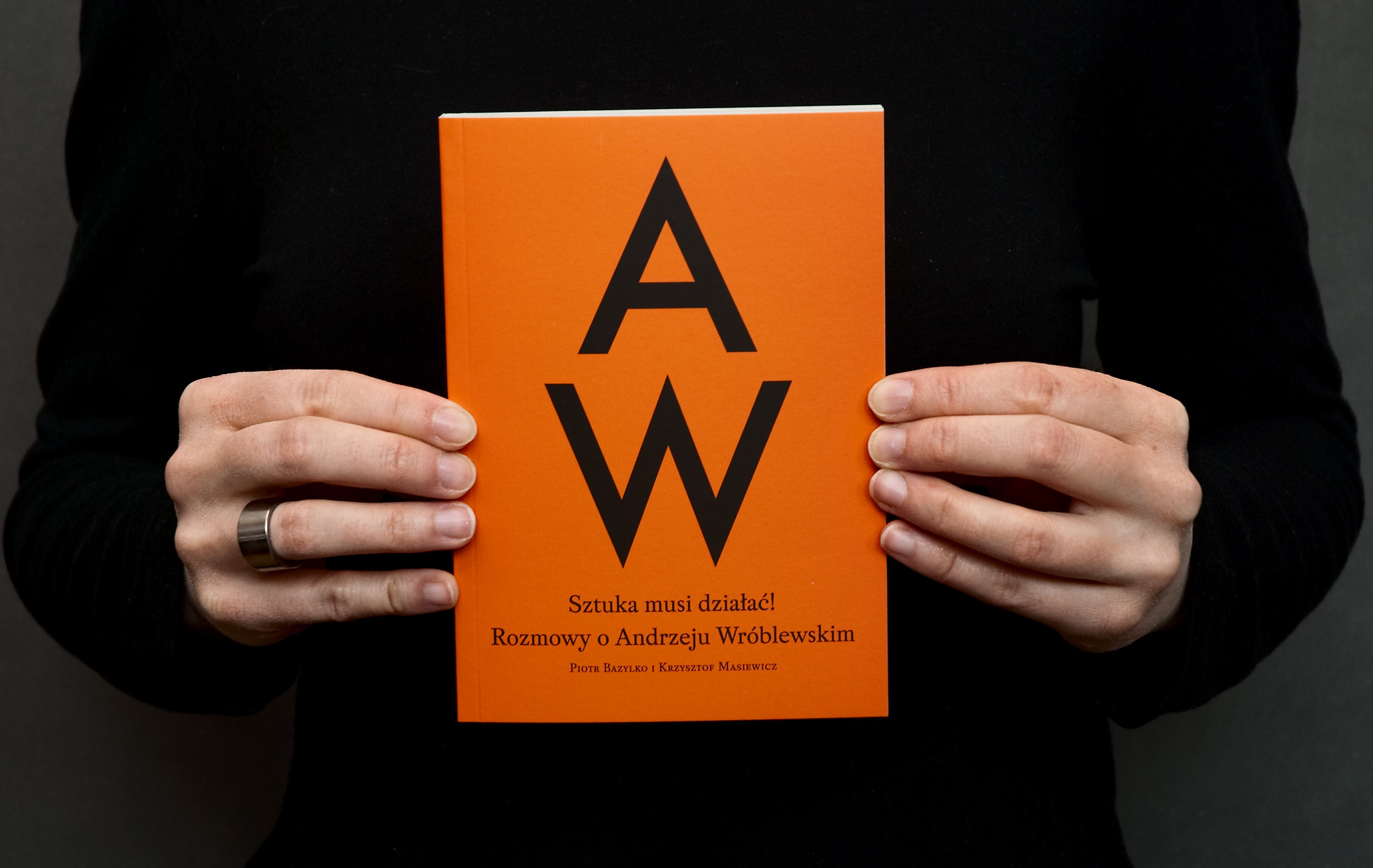
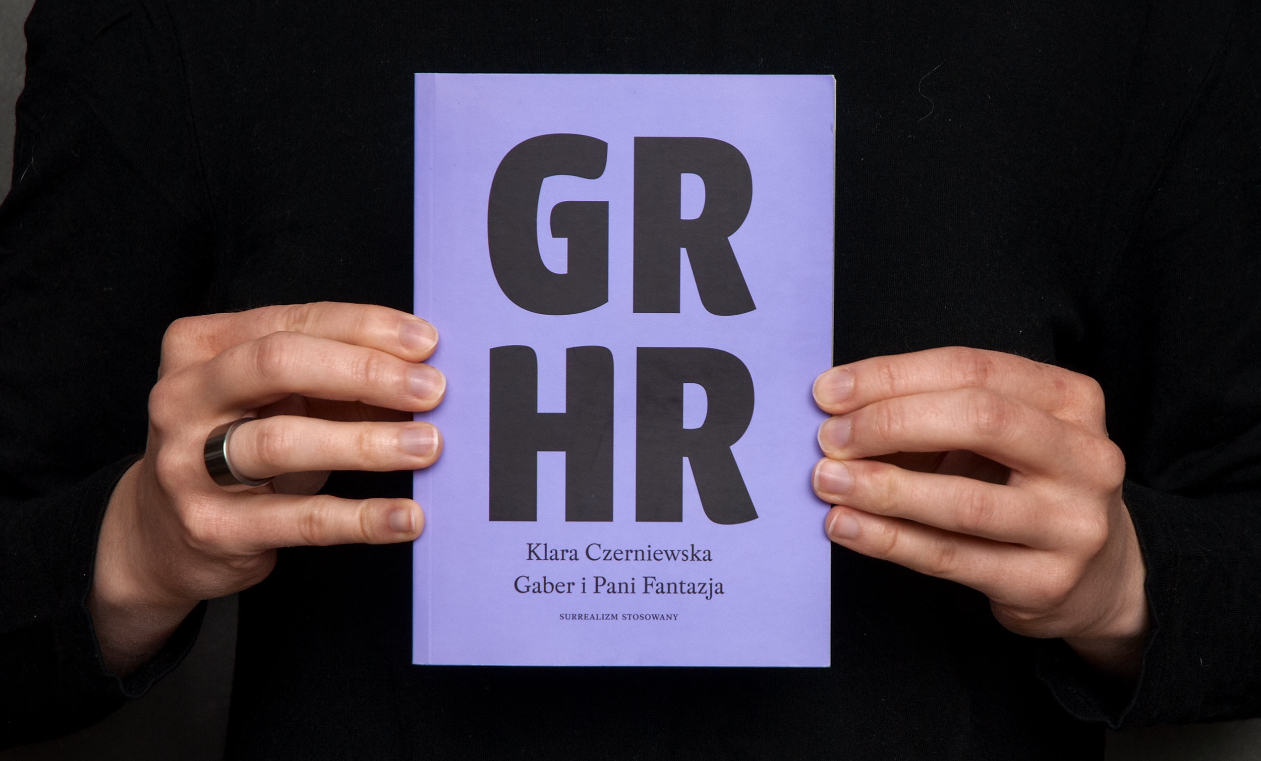
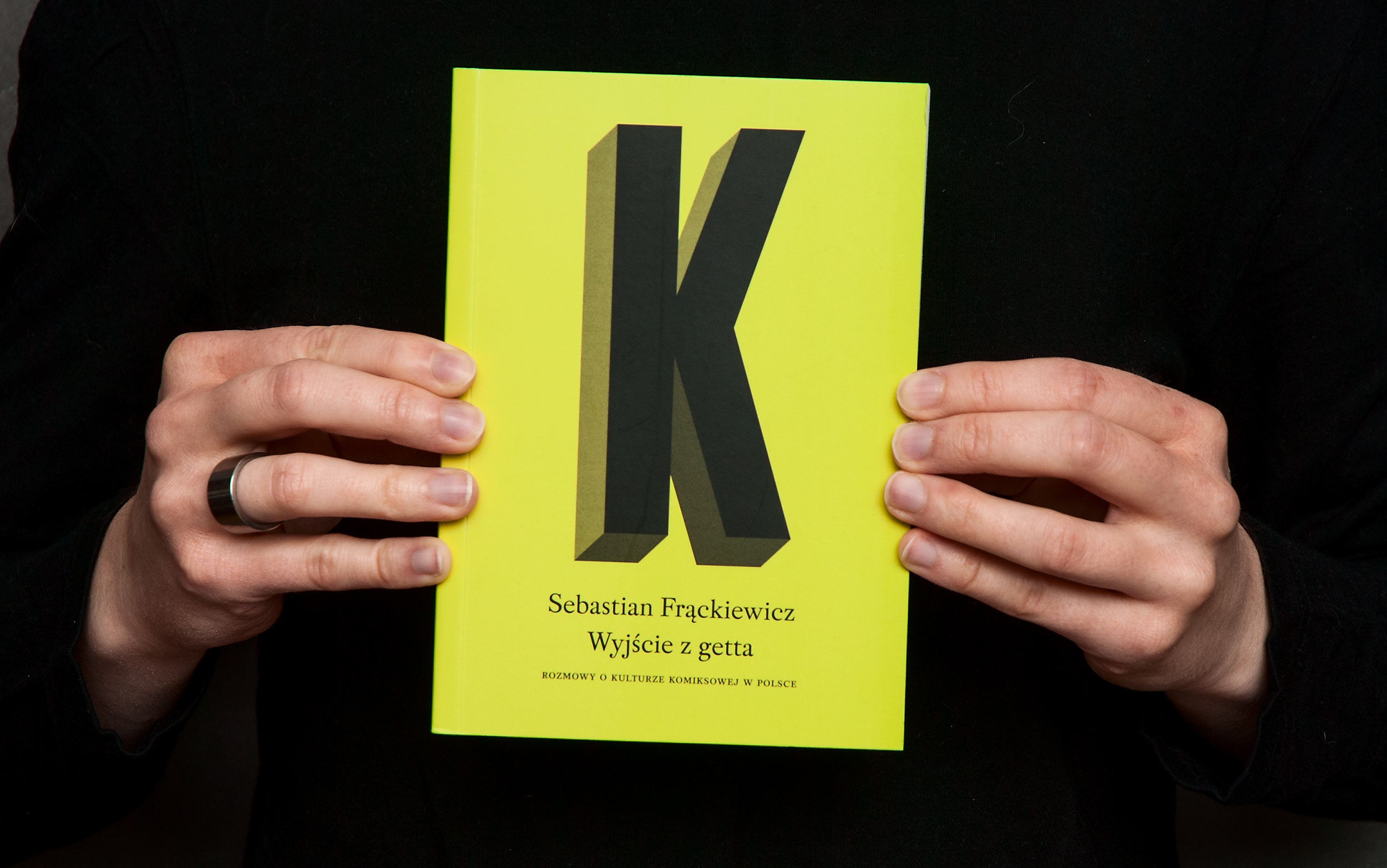
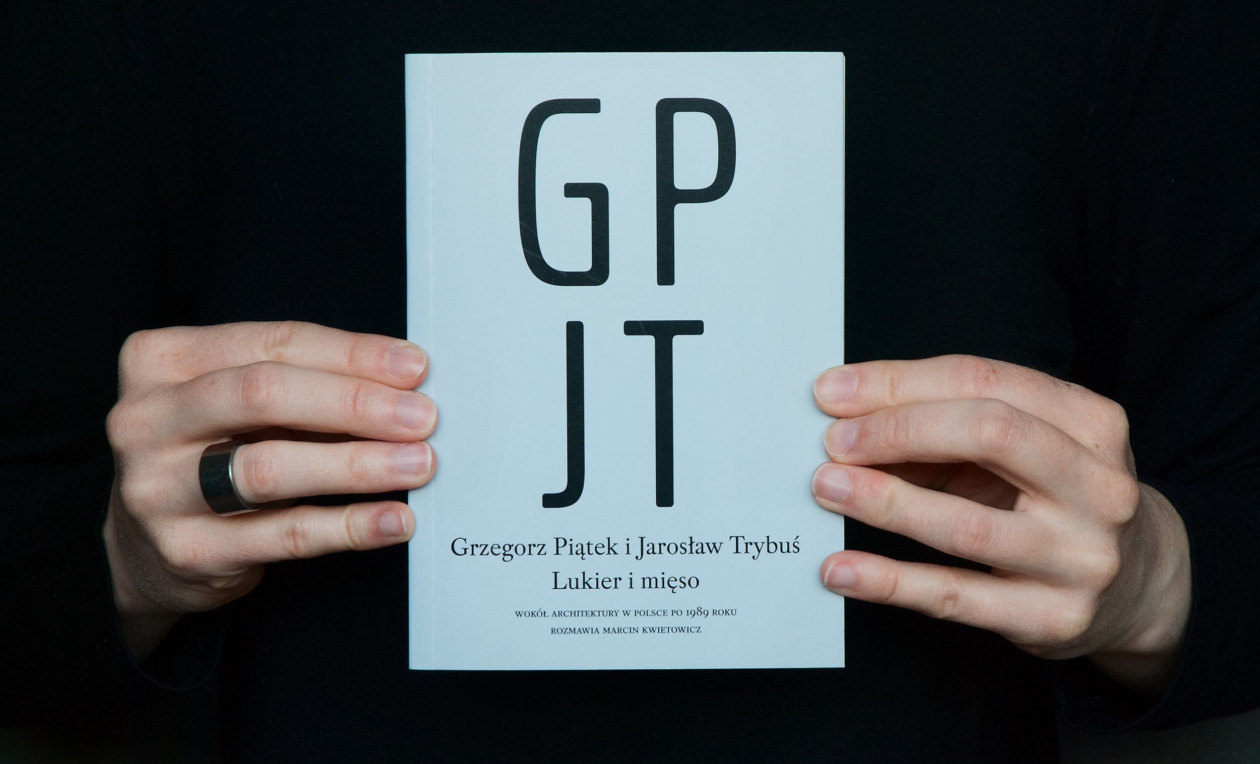
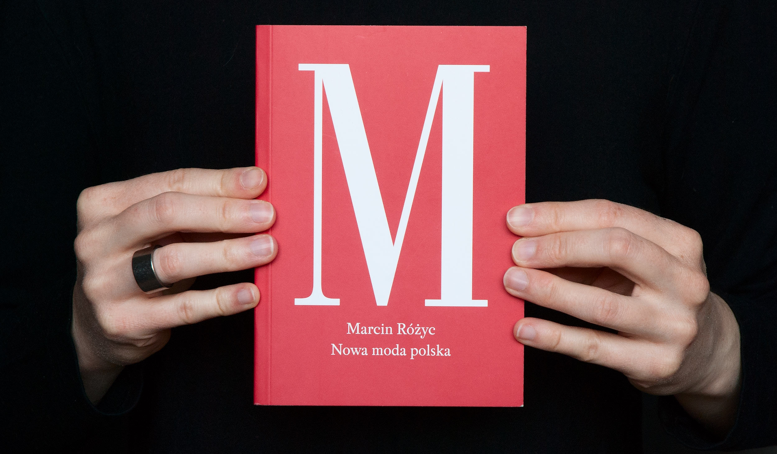
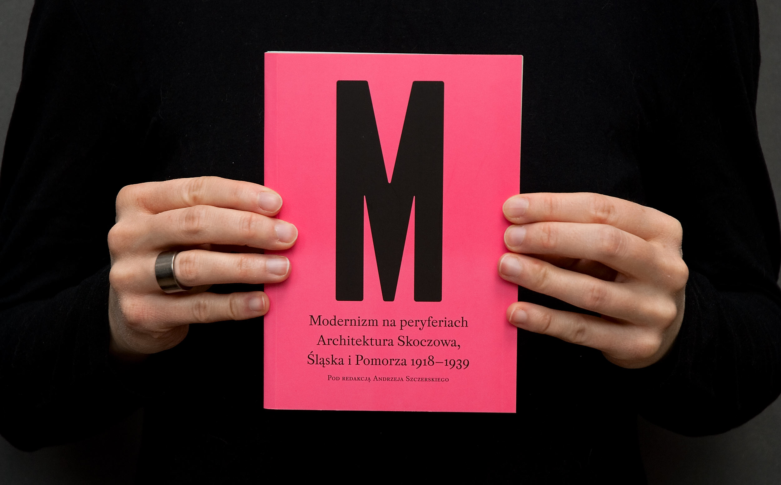
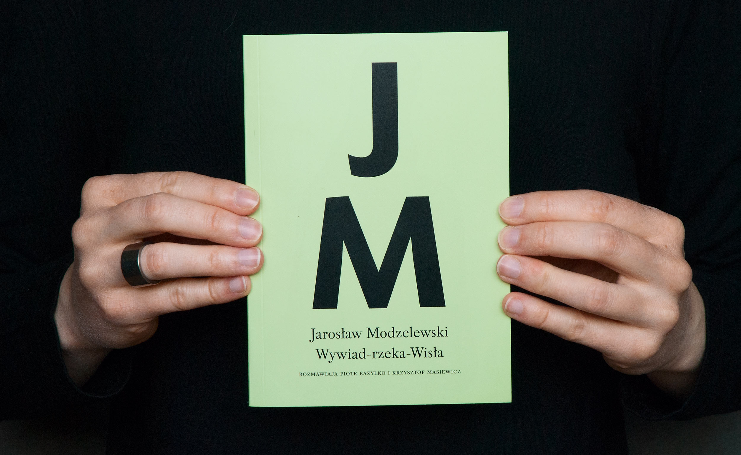
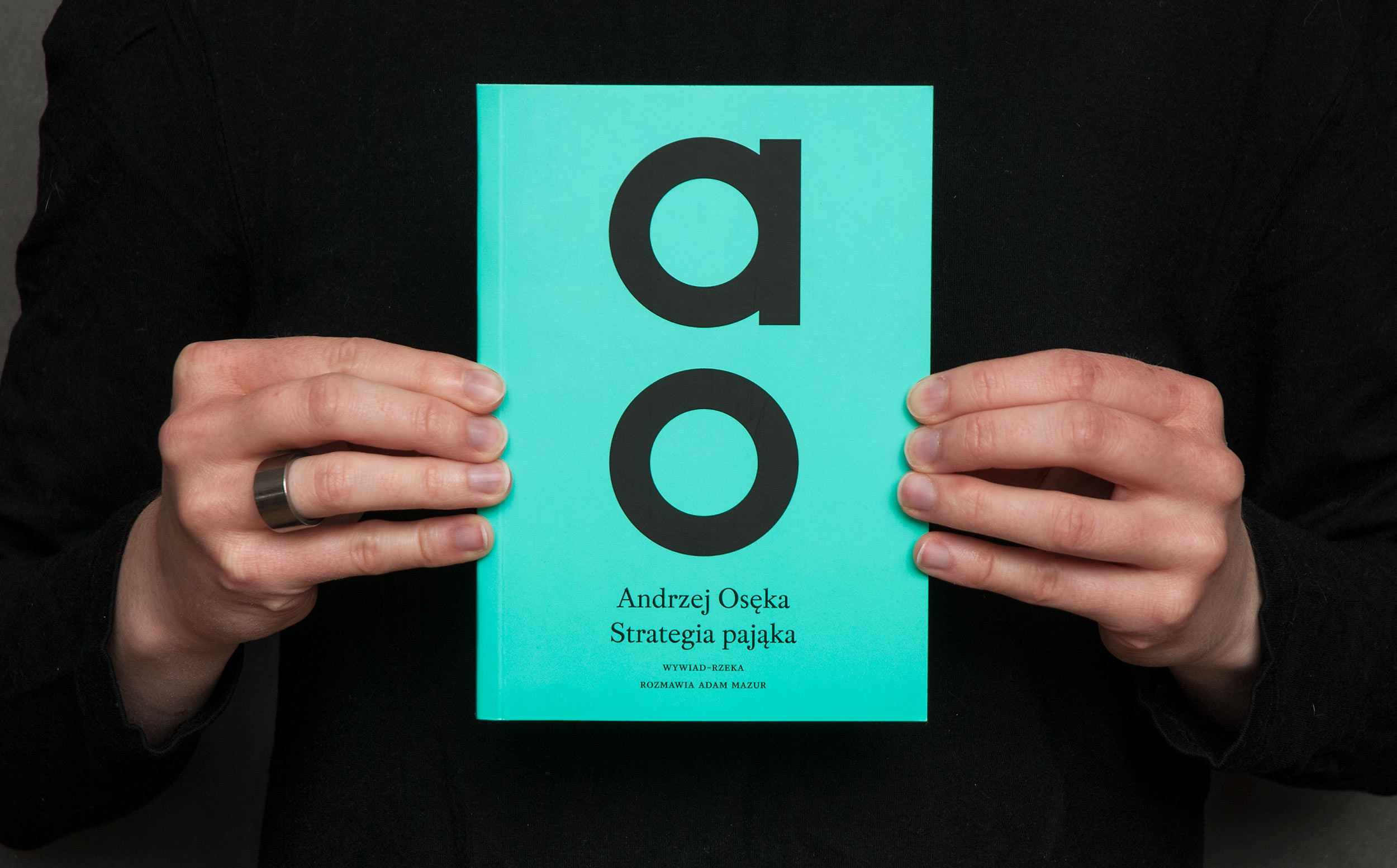
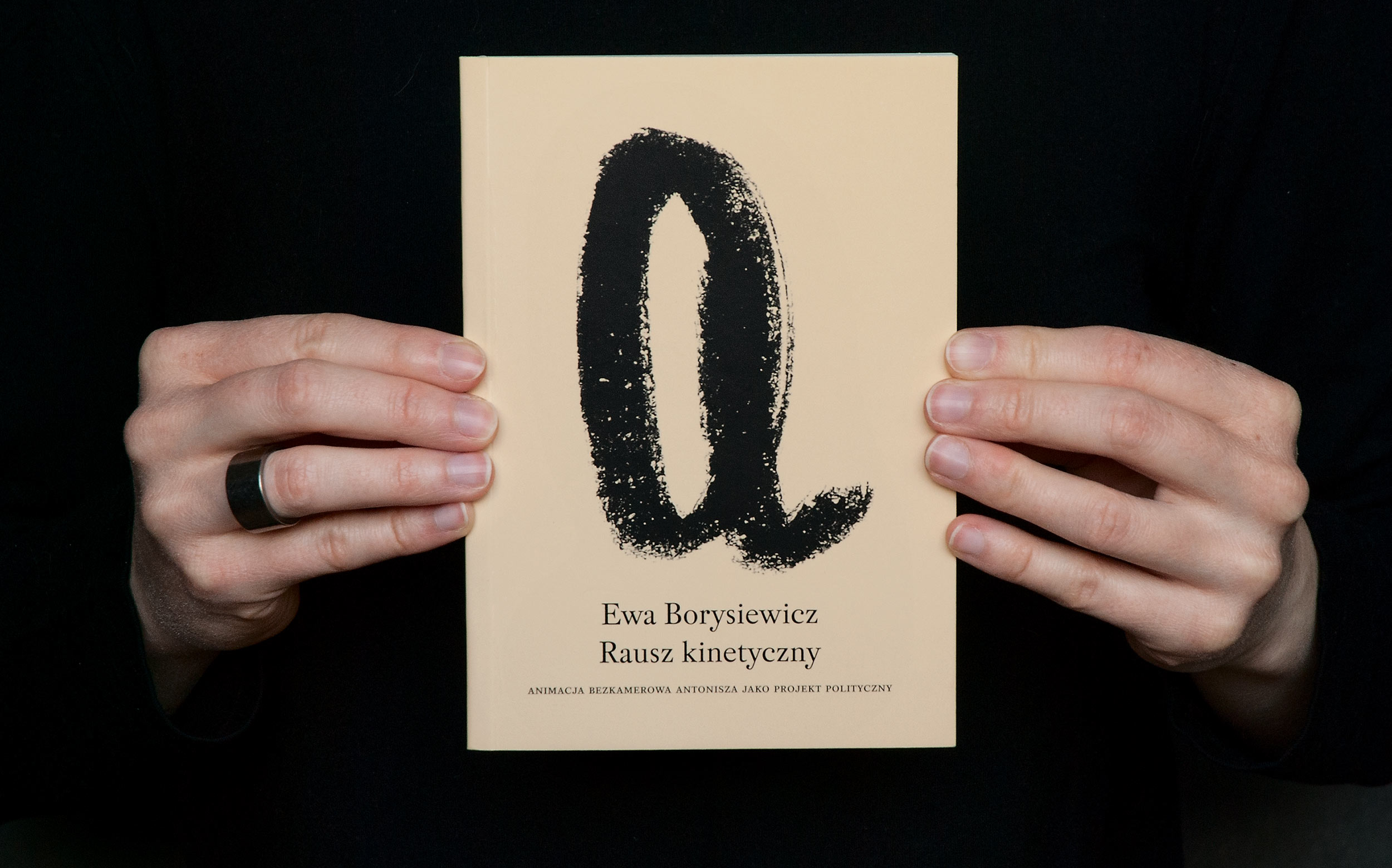
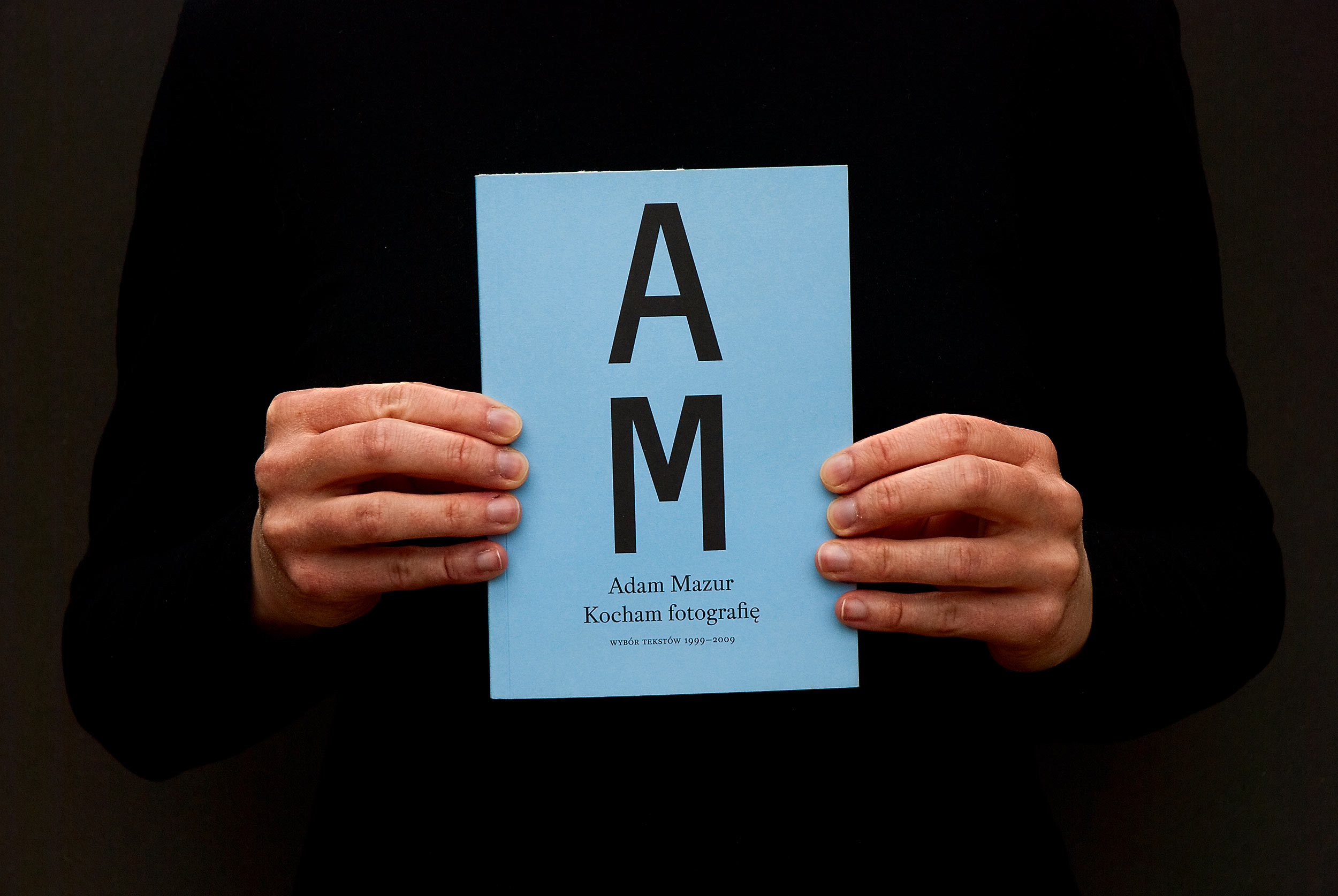
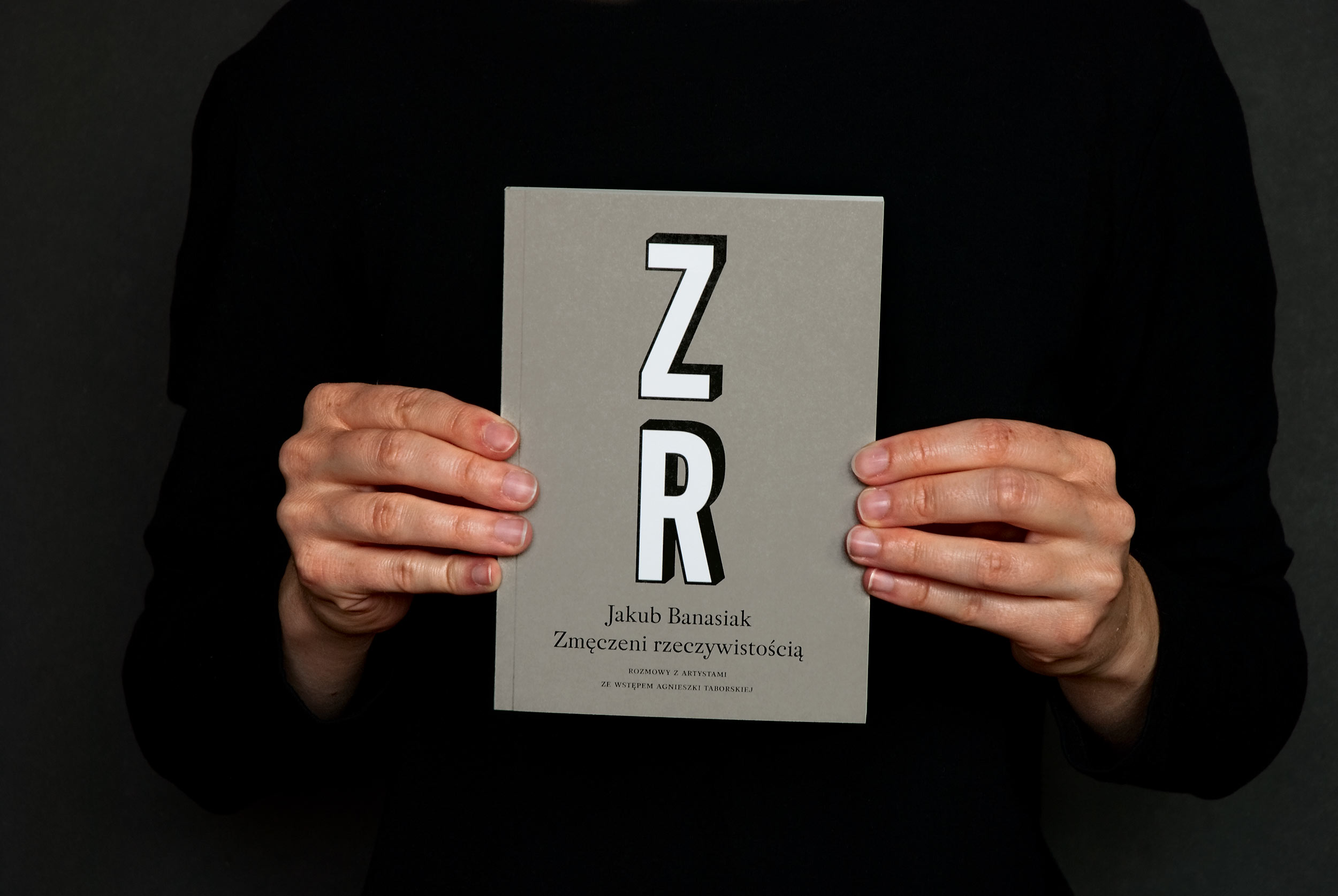
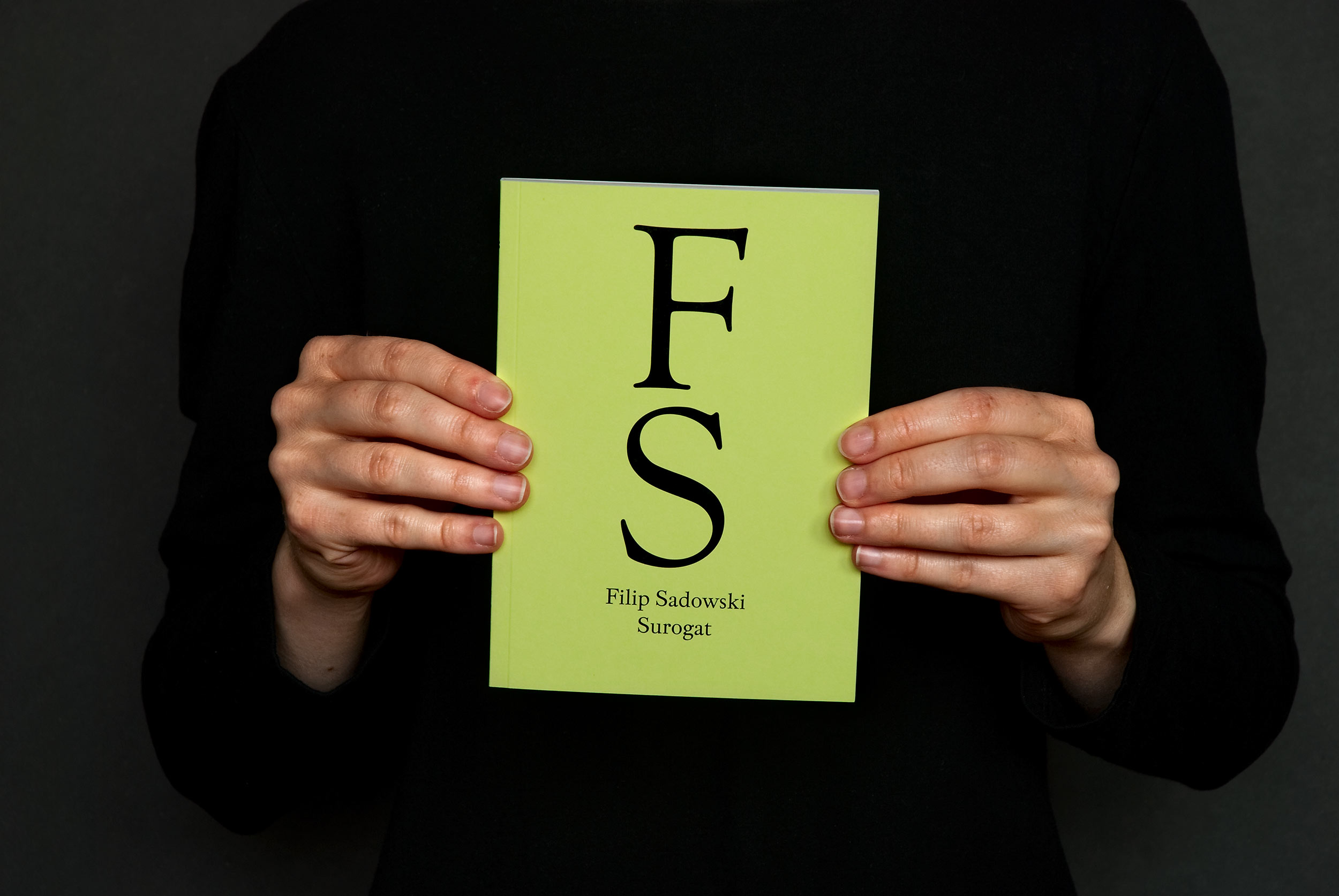
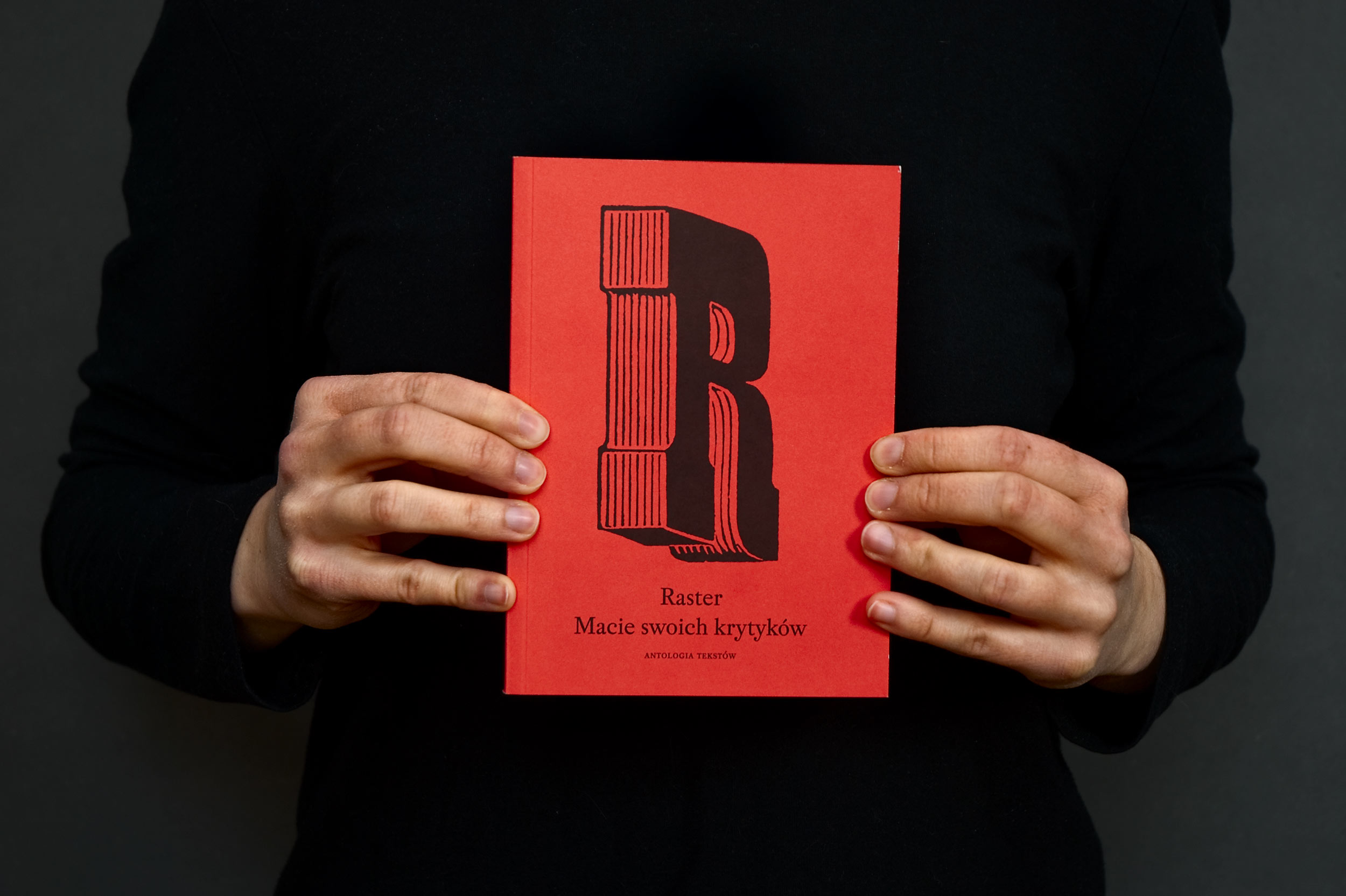
The idea for showing authors’ initials, first letter of the title, abbreviation or other set of 2 or 4 letters, using always different typeface on a different Pantone colour, seemed to satisfy all of the demands. Additionally – if I may say so – it still works quite well and haven’t aged that badly.
There was one trick that we tried on the first 3 or 4 covers. We used uncoated thick paper for the cover without adding any finishing or protecting coating. We wanted the books to age quickly and have this nice gritty natural look of often used objects. Unfortunately, readers didn’t like it and we ended up with a regular mat finish.