Zjedz to sam
English title: Eat It Yourself
Publisher: Znak
Kraków, 2012
ISBN 978-83-240-2019-5
Dimensions: 20,5 × 27 cm
Hardcover 80 p.
Currently our publisher Wydawnictwo Dwie Siostry is managing rights to this title. We moved this book from Znak to Dwie Siostry along with our other books published by Znak. We explain this move in the “Tu jesteśmy” description.
After “Tu jesteśmy” we thought that this way of drawing and narrating non-fiction picture book was distinctive enough for a recognizable series of books. The Tria markers gave us quite unique form that would bind different subjects and themes into consistent set of books.
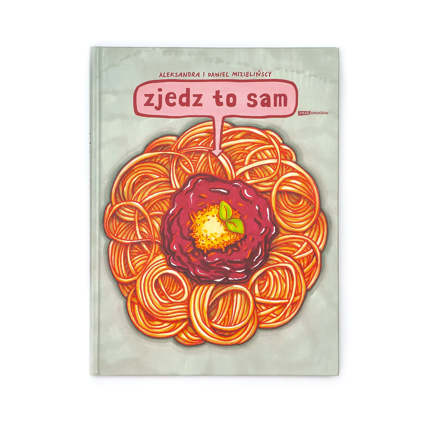
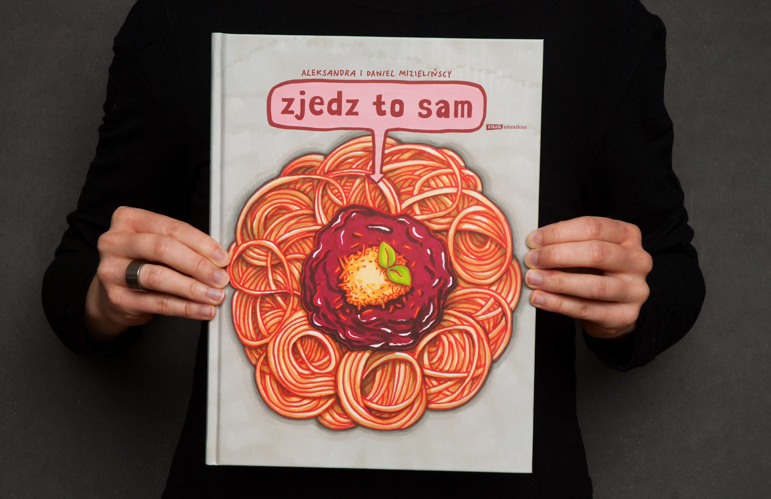
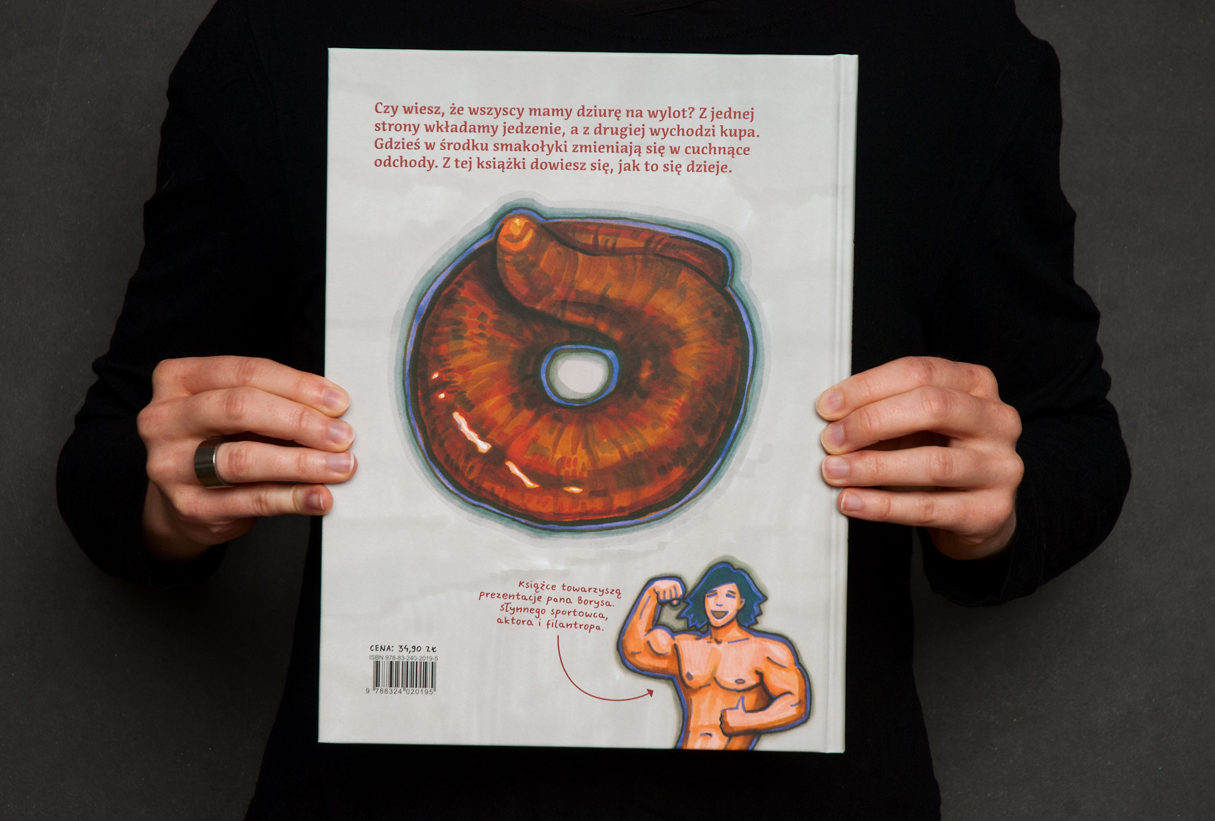
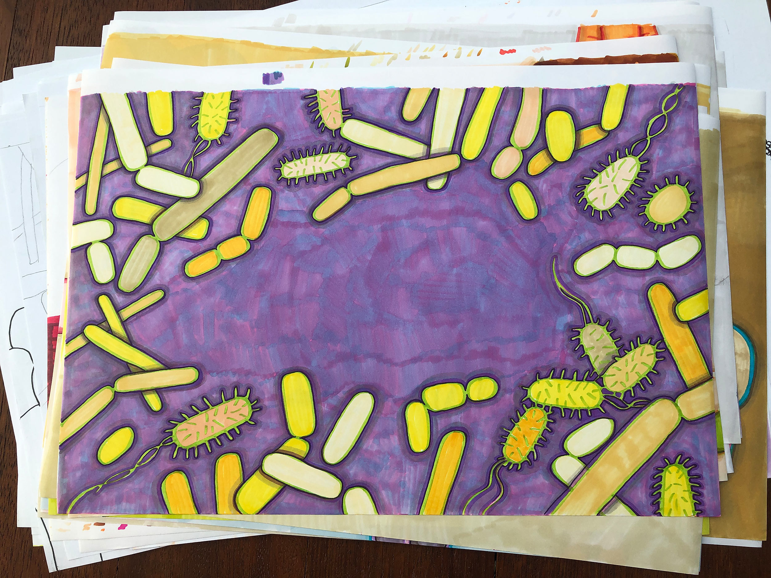
This time the idea was to show how our bodies process food. As in the case of “Tu jesteśmy”, the cover is a part of the story. The front shows delicious spaghetti and the back a nicely shaped turd. Inside you can learn about everything in between. Humour was supposed to be the main tool for the job, so we concentrated on the grows and ugly part of a digestive system.
This book uses Acuta Bold for body text and our Mr Orange for side notes. Titles are hand-drawn, but after the first printing we created font Mr Brown based on them, and eventually (after we transferred rights to Wydawnictwo Dwie Siostry – more about it in “Tu jesteśmy”) we substituted the drawings with font.
Getting familiar with favourite markers
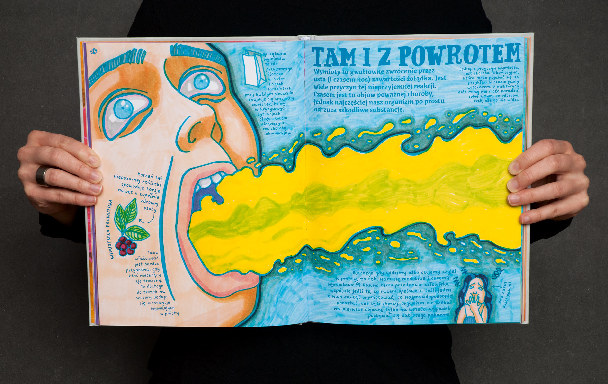
After creating “Tu jesteśmy” we wanted to continue using Tria Markers (you can read why we decided to try them in the “Tu jesteśmy” description). We now understood how to use them, so working on next project was easier and faster. The process was pretty much the same, only the subject was very different and maybe more suitable for traditional use of colour. The organic feel of each spread matched perfectly with vibrant and messy strokes of Tria brush tip. As previously, some images had to be combined using two layers (literally two pieces of paper): one with strokes and the other with fillings.
Usually before creating the final illustration some kind of sketch or pre-drawing had to be made on a separate sheet of paper. This is just because we hate using eraser. Especially on a thin paper. No matter how careful you are, eraser will crumple the paper.
As for lettering, every title was drawn on another sheet of paper. Eventually this became the base for our font Mr Brown.


Foreign editions
Korean, 밥에서 똥까지, Pulbit Publishing Co., 2020, ISBN: 979-11-6172-299-3, 978-89-7474-082-5
You can find a Google Sheet with a list of all our foreign editions here.
